Showing posts with label optical scentsibilities. Show all posts

Monday, December 24, 2007

Optical Scentsibilities: Bras de Fer

Le Male by Jean Paul Gaultier has always had some tongue in cheek imagery for its presentation. And it stuck with audiences, if only for its unapologetic exploitation of the homosexual connotation of sailors, alongside its sweet lavender-ladden scent. The issue is well documented, in fact, as attests this book devoted to it. There has even been an exhibition about gay life on the high seas. In times when sea travel was taking forever, it was to be expected.
In one such advertisement stylized pouty sailors cross their arms in a bras de fer that has them glistening their muscles in a nod to 90s gay culture. Or is this a cliché?

Whatever it is, it's certainly not that original, as far as perfume advertisments go. The bras de fer idea had been already tentatively explored in Eau Folle by Laroche print advertisements as far back as 1970. Only the couple is not indicative of a homosexual rapport, here using a man and a woman. And the mood is much less mock-serious or pouty, but more exuberant, fun and casually flirty.
Now, this curious little hat does remind me of a cook on a ship! But maybe that's just my twisted imagination...


Pics from parfumdepub

Wednesday, December 19, 2007

Optical Scentsibilities: Memento Mori

Dior Poison "memento mori" ad, "all is vanity"
How could the idea of mortality be tied to perfume? There seems to exist a plethora of references to Eros and Thanatos in scented matters. From the ancient practice of accompanying the dead to their resting place with aromatic incense and the fragrant burials in Egypt's pyramids to the annointing of the body for weddings in India with comparable scented essences, fragrance holds a key to matters of mortality. Rituals using it aim either to somehow "defeat" it (marriage and therefore procreation) or to pay their respects to the unavoidable.
But it is rare that a perfume company uses images of death to advertise their products; in this case Poison by Christian Dior.

You don't get what I am talking about? Squint. Now look again with your vampire eyes...The image of a skull is looking back at you through the mirror, the bottles and the torso of the woman sitting in front of her dresser. See?

Images of skulls abound in art and are indeed a premium means of delivering meanings that have to do with the subconcious. From the skull and bones flag of the pirate ship to more sophisticated paradigms, like this one from surrealist Salvador Dali, skulls are there to remind us that nothing lasts forever and the inevetability of death is the only centainty in life.
Of course Dali chose to depict it through naked women forming the parts of the skull, which is an allusion to the other half of the equlibrium of Eros and Thanatos. The regeneristic power of sexual desire and copulation is man's only means of transcedenting death. This of course lies at the root of ancient mysteries and rituals, such as the Orphic or Eleusinian Mysteries in ancient Greece.

During the Middle Ages, at a time when general lack of education swerved the emphasis of ecclesiastical catechy into iconography rather than scripture, images of horrible monstrosity became almost normal in the abodes of the holy. One only has to take a look at the gargoyles of late-Gothic churches across Europe to ascertain this. In this environment the notion of Memento Mori flourished; a typically simple depiction of a skull making an appearence somewhere along a painting, a psalm book, or a tapestry.
The habit persisted through later years and this painting of Jean de Dinteville (depicted at left) by Holbein is testament to it. If you look at it from the left and squint enough, you see that at the bottom of it there is an elongated form of something that does not seem like anything much, but in fact is a symbolic skull.

And how would this culminate in the above Dior Poison advertisement? Simple: the name Poison lends itself to imagery of Thanatos, through its connotations of its meaning and the fairy tale poisoned apple like its bottle shape suggests. Apple, a fruit full of its own connotations of sin and corruption!
Perhaps the advertisers want us to remember that just as their perfume can symbolically be lethal (and in copious amounts I am sure it can be!), it can also put a spin into the other half of the eternal duo: Eros.


Pics from moiillusions.com and nationalgallery.org.uk. Thanks to Sillage for bringing the initial Poison ad to my attention

Monday, December 3, 2007

Optical scentsibilities: Neck Rings

Who isn't familiar with the Christian Dior advertisements for their feminine perfume J'adore? Before enlisting Charlize Theron and her fabulous physique, it was Carmen Kass and her graceful East European neck who adorned the pages of glossies. The gold hoops round her neck were shining much like those on the long, giraffe-like top half of the bottle iteself, elongating it, giving it a graceful line upwards. Very innovative, right?

And yet, when one looks back on advertisments from a previous era, one sees that that this is not the case. In fact, Jean Desprez, a perfumer who launched his own creations and not under the wing of another house ~a practice unusual for the second half of the 20th century~ had used this idea for his classic oriental Bal a Versailles, back in the 1960s. The advertisment of this one is more sketchy and less realistic, but the idea remains the same. The rings around the neck, the elongated line that hints at vulnerability. An idea of woman as a constricted being who is subject to the desires of some unattainable ideal, inflicted by men. One could write a whole treatise on this alone! However to revert to more arty rather than feminist issues, every little trait of the two images conspires to show that they both drew their inspiration from yet another source; a source much more in the real world than one would anticipate.

None other than the constrictive beauty ritual of the Giraffe Women of Thailand. In a practice that rivals that of the bound feet of Chinese women (Google the term only if you're brave), those women put rings around their necks producing an effect that although more of an optical illusion than real elongating, it has the unfortunate characteristic of seriously oppressing the collarbones and ribs into an unnatural shape in the long run.
Everything in the name of an unrealistic, unattainable beauty? Putting on perfume is so much easier comparatively. The rest is up to you...as always.


Pics of ads from parfumdepub, pic of giraffe woman from paradise tour.com

Friday, November 23, 2007

Optical Scentsibilities: imitation is the sincerest form of flattery

Surely you have heard the above dictum: "imitation is the sincerest form of flattery". It's actually a quote by Charles Caleb Colton (1780 - 1832) Lacon, volume I, no. 183. The man had won a place in my heart for his other quote: "Many books require no thought from those who read them, and for a very simple reason; they made no such demand upon those who wrote them". But perhaps it is irrelevant to perfume advertising, so let's focus on the first one.
Now you might call me wicked and you might call me laborious in search (and I might be both), but don't you get an eerie resemblance between those two images? F by Ferragamo, by the way lauched in 2006 while Femme by Rochas was advertised thus some years ago. And one might argue that the hand on the nape is a classic pose anyway. After all, there are other examples of such images in advertising. But I propose to you that this duo is a bit eye-catching. The position of the hands, the choice of angle, even the dishevelled hair! Don't you think?


And then of course there are the instances in which there is some imagery that, although quite common and classic in positioning, angles, shades and all the paraphernalia of photography and art synthesis, inspires itself another copy.

Directly, I might add and not indirectly, which might be understandable and quite common. We have numerous times stressed the importance of influence here at the Shrine. However, yes, this artwork at the right hand is indeed an actual painting, meant to be hung at somebody's wall. And if you pay a minimal amount of attention you will notice that not only it reproduces the pose, shades and general feel but the people depicted are the spitting image of the models appearing on the Ralph Lauren advertisment of Romance (Lauren's romantic approach to scents for women and for men launched a few years ago).
To me, this is a case of cart leading the horse instead of vice versa...


Many more exciting optical scentsibilities soon and please be tuned in for a review of a smashing sexy scent shortly!


Ads from imagesdesparfum and parfumsdepub. Artwork Insieme I by Escha courtesy of angelart.com

Friday, November 16, 2007

Optical Scentsibilities: head thrown back in abandon

It had been no secret that Tom Ford's Black Orchid for women photoshoot involving Carin Roitfield's daughter (Carin being the editor in chief of French Vogue, no less) had been "inspired" by old Hollywood iconography. Tom Ford if nothing else is a brilliant marketeer who can always be relied upon to know which images will tick the fancy of his target audience. Or perhaps not.

In this case he was inspired by this Veronica Lake photo {click to see it!} by George Hurrell from 1941. The famous peek-a-boo platinum hair is now spawled all over the bed in a pose of surrender and what seems like vague expectation of who knows what.
A phone call, a caress, a bullet?


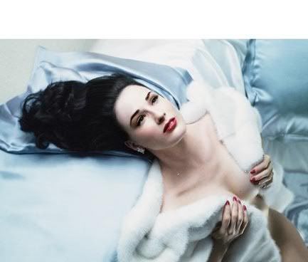
Dita von Teese, that gorgeous specimen of burlesque, has always relied on old-style Hollywood glam to project her divinely contrasted features. I had used this exact pic in lieu of the official one when I reviewed Black Orchid upon its launch {click for review}. It had seemed more glam than the official one and besides Dita has been a favourite for a long time.

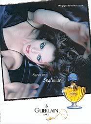
Guerlain also had their own share in this department, alloting their iconic oriental Shalimar a place for this pose of surrender.

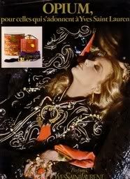
The original Opium advertisement with Jerry Hall, poster child of the late 70s, early 80s was first to be inspired by the glamour of yore. In this photo shoot she throws her head back as if high on the addictive powers of Opium. Very fitting considering the line is "For those who are addicted to Yves Saint Laurent".


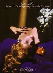
This was my favourite from the group of Opium advertisments, if only because the fiery red of the model's hair (is it Angie Everheart?)is so complimentary to the cinnabar/vermillon colour of the perfume's flacon and so antithetical to the electric blue background. Remember electric blue, that favourite shade of the 80s that was vibrant like cloud charges on a night of temptest? It offset other shades so vividly...
Of course that pose can be also traced back to Veronica Lake in another shot by George Hurrell. This one: here! Pretty amazing, huh?

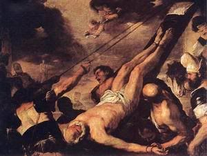
Perhaps one might trace the positioning of the body in such a manner to painting in the first place. In particular the iconography of St.Peter’s crucifixion, here by Luca Giordano (1692). Martyrs are often depicted in poses of abandon, as if they are left to their fate, willingly surrundering themselves to higher exigencies.

Then again I might be pushing it…


Ads from okadi,imagedesparfums and parfumsdepub. Veronica Lake pic from Ebay. Painting Crucufixion of St.Peter by angel-art-house.com

Friday, November 2, 2007

Optical Scentsibilities -new feature!

Perfume Shrine has an eye for the visual as well as a nose for the olfactual, as has surely been apparent to our readers by now. In the interests of pursuing the investigation of common themes running through perfume images, a new feature is introduced: Optical Scentsibilities. A feature focusing on elective affinities among images concerning fragrances that will run regularly from now on.

The idea came up while releafing my art books, which abundantly depict what Umberto Eco has so infamously made an academic career out of: semiotics, of course. Like "books talk about other books", images draw inspiration from other images and perhaps instill a new twist on an older theme. In this sense there is no purpose of talking about "plagiarism", as it is well established that there can be no parthenogenesis in art. Basically, everything has already been said and there is nothing trully new under the sun. However it is interesting to contemplate just how some undercurrent runs through similar concepts.

Today we focus on two takes on the dark-silhouetted-profile hovering over a bottle resting on the top of the knee. Here is an example by Fidji, the green floral perfume by Guy Laroche. The brilliant tagline reads: "The bare essential. All it needs is you". There is a quiet anticipation in the picture, as if you are waiting for that face to turn into focus, into the light and speak. Which is obviously what the perfume does for you, anyway...

And there you can witness a comparable image advertising the floriental Boucheron Femme. There is a difference in more overt sensuality in the second paradigm, conveyed through the half opened lips, which is logical considering that the advertisement came out in 2003 (and it had a similar male counterpart for Boucheron Homme), while the one for Fidji is older (per my calculations late 70s to early 80s). In most other regards however there is an uncanny similarity.


Another case is within the same brand: Rochas did a very similar print campaign for two of their feminine perfumes. Lumière came with this advertisment in 1986 (the scent first launched in 1984 and got re-orchestrated in 2000, reportedly to its detriment): the nude feminine back holds an aura of subtle seduction, seemingly vulnerable and leading to other paths to sensuousness. In this image the soft focus of the lilac colour palette imparts a soft halo of romanticism.


Contrast with this one, for Rochas' Mystère (scent launched in 1978, the ad is from the 80s). The same position of the model, focusing on the nude back and with a coif to match, but this time with a more dynamic arm position which, with its arrow line, suggests a certain assertiveness and with a dark yet fiery colour palette that hints at more seductive intentions.
I am guessing that here we have a case of a brand wanting to establish an homogenous aesthetic in its products and I think it succeeds in providing a backdrop of reference. This intent is more apparent if we notice the taglines: "Vous laissez tant d'énigme derrière vous" (=you leave such an enigma behind) for Mystère and "Vous laissez tant d'éclat derrière vous" (=you leave such a luminosity behind) for Lumière. If you are extra attentive you will also notice that the names are analogous in number of syllables, intonation and way of pronunciation.
Bravo, Rochas advertising team!


Pics from cofe.ru, image des parfums, parfums de pub and Ebay

This Month's Popular Posts on Perfume Shrine